PATA Finance
PATA Finance is an affiliate of the PATA Group, one of the largest vertically integrated companies in the Baltics with a broad presence in the forest sector in Latvia.
PATA Finance was born out of the lack of a specialised financing provider in the forest and agriculture sector that understands the needs of clients searching for financial support and can provide fast, affordable and efficient financing when it is really needed.
Year
2022
Website
My role in the project
Design, Design System, Research, User testing
Made together with
TRY Dig Latvia
Total project length
4 months

My role in this project
Art direction together with creating a full design system.
Large scale user dashboard creation to engage more with returning customers.
Qualitative user testing to prove initial assumptions.

Solutions
With the help of the initial research phase where some of the ideas were brainstormed and tested, we managed to create good deliverables in design. Qualitative user testing proved that the majority of people would add this homepage as part of their daily routine because of the useful functionalities in the dashboard.

Process & approach
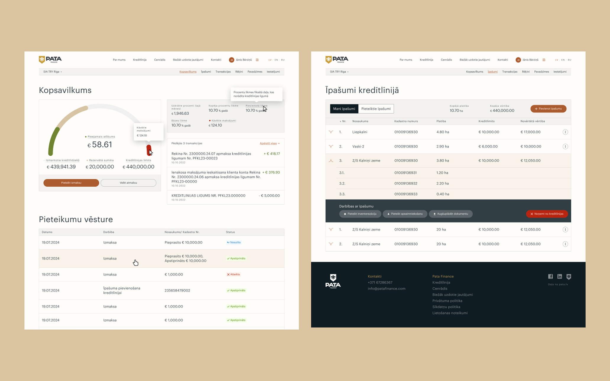
While the public sections didn’t require much wireframing, our design team knew exactly what to do to make things a little better for this part of the project. Together with creating design screens a large scale design system was created to make sure that we have all the tools for the rest of the upcoming updates.
When it comes to the internal dashboard, the client already had a good idea of what the sections of the dashboard might look like, so our job was to make sure that everything was created and aligned with the best practices of good usability principles. Product is quite complex so multiple workshop sessions with stakeholders were required. But even with many internal discussions it was clear that we are not the best suited people to judge what’s been created so a series of on-site user tests were held with people that have already used PATA Finance before or plan to use it. User testing was done with a clickable prototype of the newly created dashboard tool.
In these tests it was clear that 75% of people would use the tool as part of their daily workflow so it can help them better see the status of their properties and loans. Qualitative user tests showed a good insight both to project designers and stakeholders of what users actually think about when working with this dashboard.